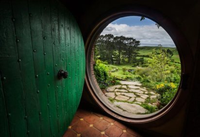

Are you signed up for Camp NaNoWriMo? There’s still time!
I’m super thrilled about my project this go around. I will NOT be completely winging it like I did in November (because Cover Up is a MESS), plus I’m getting in some good therapeutic writing.
 Thankfully, since the day I somewhat angrily came up with this brilliant idea for a novel, things are sooo much calmer. My wine consumption has returned to normal (like I did NOT try to drink red wine out of a chocolate easter bunny like the Internet suggested – even though I had both a hollow chocolate bunny AND a bottle of red wine at home).
<—-
We’re super focused on saving money now and trying to figure out what the next step is career-wise for me. Cue existential crisis, but I had one yesterday so we don’t need to do that again today. Continue reading


 this on many books. Take for example any Stephen King novel. All of them has his name written so big. I get it that he wants to promote his books by his name and people will buy his books just by seeing his name on the cover but is there really a need to highlight the name so much? I think it gets on my nerves how the cover looks with name so big.
 The second most disturbing thing is that the height of the books changes with every sequel. There is no similarity in the whole series and it makes it weird seeing the books on my shelf. I just wish every book to have somewhat same height. It sure seems to be monotonous but in the end it’s a series.